




软件

产品


某日,一好友给我发了国外运筹学的一个小作业,共三题,问我是否有想法,看了一眼,看到了第一题是之前接触过的时间序列分析,便只做了这一道题,我也是在此过程中第一次接触到了双指数平滑法。(文章未写完,后续会更新)
我的参考资料来自 https://support.minitab.com/zh-cn/minitab/18/help-and-how-to/modeling-statistics/time-series/how-to/double-exponential-smoothing/methods-and-formulas/methods-and-formulas/
双指数平滑法是指数平滑法中的一种
Question 1. [40 marks] A time series dataset is provided in the Excel file “data.xlsx”
which contains 156 data points.
(1) Describe the dataset. Consider various aspects, for example the graph, the
“pattern”, the trend, etc.
(2) Treat the data points as they follow a linear trend model. Generate 𝐹 157 𝐹_{157} F157, 𝐹 158 𝐹_{158} F158, … , 𝐹 208 𝐹_{208} F208 by using Double Exponential Smoothing method with S 0 S_0 S0 = 30, B 0 B_0 B0 = 10, α = 0.3, β = 0.1 and present the forecasts and real observations in one graph. Round your answers to 3 decimal places. Conceptually do you think this is appropriate for this particular dataset? Why?
(3) Use a different way to produce 𝐹 157 𝐹_{157} F157, 𝐹 158 𝐹_{158} F158, … , 𝐹 208 𝐹_{208} F208 and make a comparison with your result in (2), provide sufficient explanation/reasoning. Again present the forecasts and real observations in one graph. Round your answers to 3 decimal places.
(1)To plot the graph, we need to import and preprocess our data first
library(readxl)
library(TSA)
library(forecast)
data <- read_excel("CW Forcasting_Data_update.xlsx", col_names = FALSE)
data = ts(data[2])
colnames(data)[1] = 'measure'
View(data)
plot(data, xlab = 'time', ylab = 'measure', cex = 0.6, type = 'o')
get the graph:
 From the graph, we can get
(2) Use function HoltWinters() in R,
data_fit = HoltWinters(data, alpha = 0.3, beta = 0.1, l.start = 30, b.start = 10, gamma = F)
plot(data_fit, xlab = 'time', ylab = 'measure', cex = 0.6, type = 'o')
# Version 8.1 has not reported funvtion “forecast.HoltWinters”,use forecast() instead
data_pre <- forecast(data_fit, h=52)
plot(data_pre)
data_pre
get the graphs: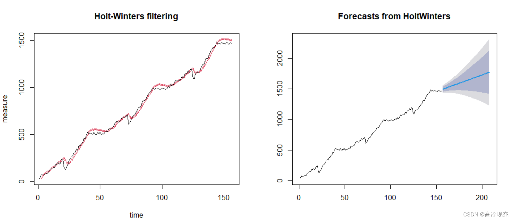
> data_pre
    Point Forecast    Lo 80    Hi 80    Lo 95    Hi 95
157       1494.277 1451.992 1536.562 1429.607 1558.947
158       1499.746 1455.218 1544.274 1431.646 1567.846
159       1505.214 1458.156 1552.273 1433.245 1577.184
(后面的数据篇幅长,不进行展示)
The column “Forecast” is the result we want.
I think the result is not so good, there’re two main reasons:
(3)we use function auto.Arima() in R to seek for a better result
data_fit2 <- auto.arima(data)
data_fit2
data_pre2 <- forecast(data_fit2, h=52)
data_pre2
information of the model
> data_fit2
Series: data
ARIMA(0,1,0) with drift

Coefficients:
       drift
      9.2839
s.e.  1.8794

sigma^2 estimated as 551:  log likelihood=-708.6
AIC=1421.2   AICc=1421.28   BIC=1427.29
To be honest, the values of AIC and BIC are also not good, let alone it, we next see the prediction, whatever we choose our model, the final goal must a good prediction.
par(mfrow = c(2,1))
plot(data_fit2, xlab = 'time', ylab = 'measure', cex = 0.6, type = 'o')
plot(data_pre2)
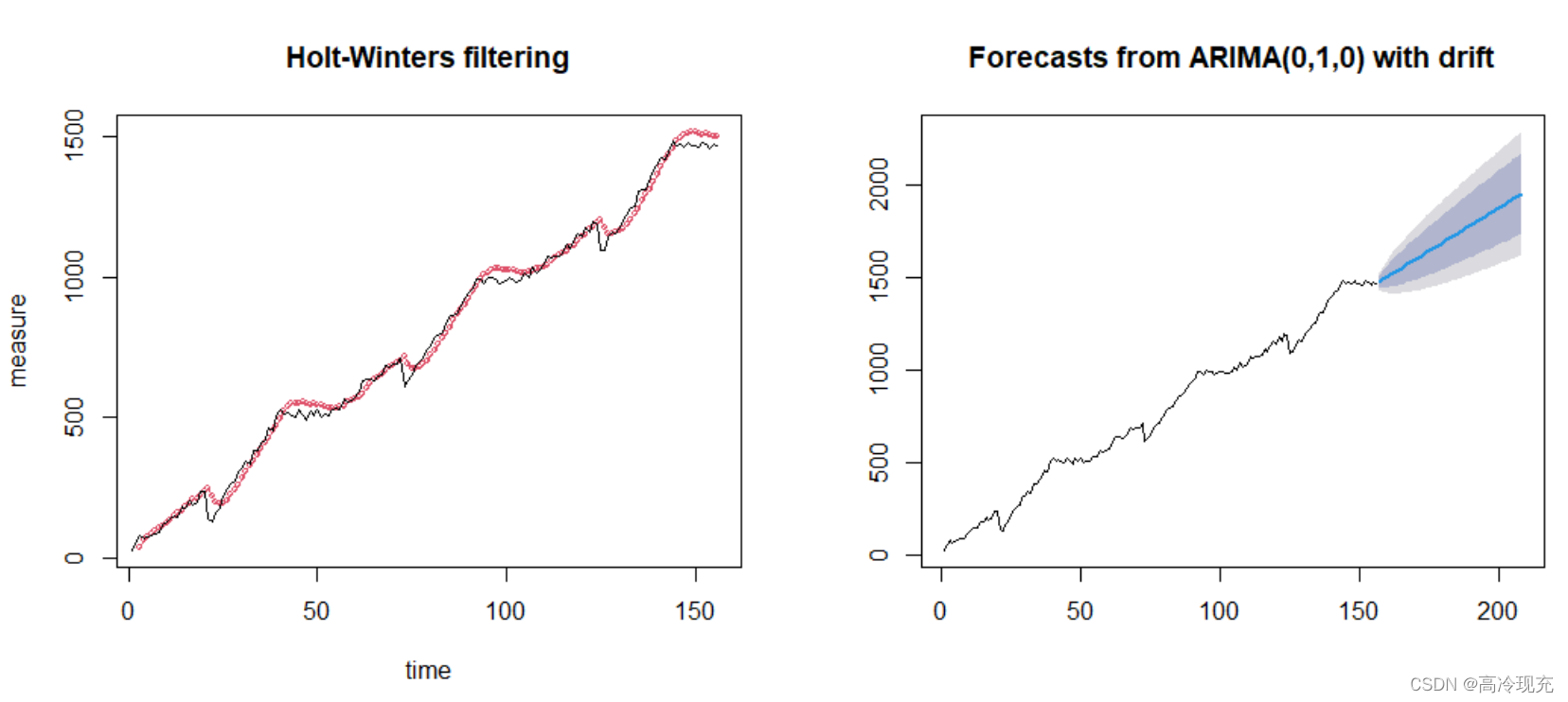
The left graph is similar to (2), but the right one get a higher score!
Compare the prediction of 𝐹 157 𝐹_{157} F157, 𝐹 158 𝐹_{158} F158, … , 𝐹 208 𝐹_{208} F208: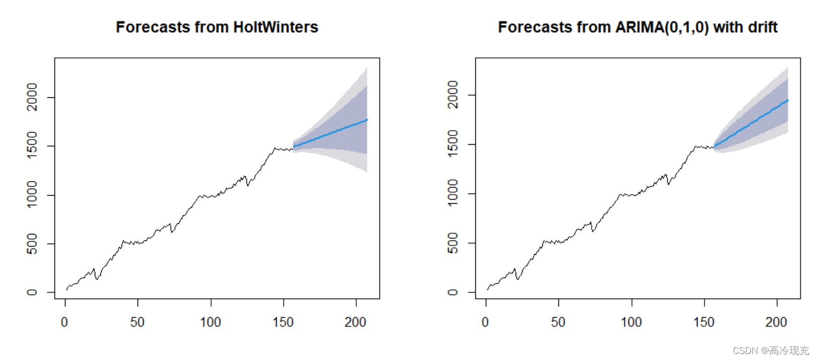
The confindence interval and prediction interval significantly reduced .
And the predictions are:
> data_pre2
    Point Forecast    Lo 80    Hi 80    Lo 95    Hi 95
157       1477.284 1447.200 1507.368 1431.275 1523.293
158       1486.568 1444.023 1529.113 1421.501 1551.634
159       1495.852 1443.745 1547.958 1416.162 1575.542
(后面的数据篇幅长,不进行展示)
The column “Forecast” is the result we want.
免责声明:本文系网络转载或改编,未找到原创作者,版权归原作者所有。如涉及版权,请联系删
 技术文档
技术文档
 推荐好文
推荐好文






 155-2731-8020