


软件

产品


我们需要明白一点,在向读者展现图形的时候,图形的格式很重要。修改图形的格式,使新的style更加漂亮,
将很大程度上提高图形的交互性,使工作更加有效。
这一节中,我们要学习的怎么在已经作出的图中,修改格式。一般而言,你可以在你的plot中做任何事情,修改
任何的格式,我们并不会介绍所有的style,只是介绍最基础的图形格式:改变图形大小,颜色, 字体 ,添加标题,
去掉坐标线。
每一个工具都有自己特有的API函数,来修改不同的style,例如matplotlib和seaborn等都要去查对应的API。
import pandas as pd
import numpy as np
import matplotlib.pyplot as plt

%matplotlib inline
df_reviews = pd.read_csv('../dataSet/winemag-data_first150k.csv',index_col=0)

df_reviews.head(3)
| country | description | designation | points | price | province | region_1 | region_2 | variety | winery | |
|---|---|---|---|---|---|---|---|---|---|---|
| 0 | US | This tremendous 100% varietal wine hails from … | Martha’s Vineyard | 96 | 235.0 | California | Napa Valley | Napa | Cabernet Sauvignon | Heitz |
| 1 | Spain | Ripe aromas of fig, blackberry and cassis are … | Carodorum Selección Especial Reserva | 96 | 110.0 | Northern Spain | Toro | NaN | Tinta de Toro | Bodega Carmen Rodríguez |
| 2 | US | Mac Watson honors the memory of a wine once ma… | Special Selected Late Harvest | 96 | 90.0 | California | Knights Valley | Sonoma | Sauvignon Blanc | Macauley |
继续使用我们前面介绍过的bar plot。
df_reviews['points'].value_counts().sort_index().plot.bar()<matplotlib.axes._subplots.AxesSubplot at 0x7f15674e0d68>
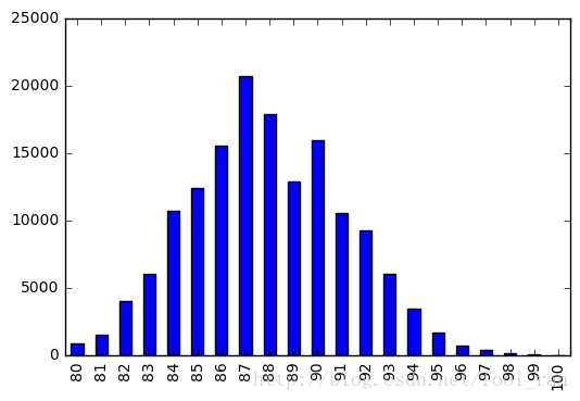
虽然这个图片,看起来还不错。但是如果你想修改它的大小,更清晰的看清细节,我们可以使用参数figsize来实现。
df_reviews['points'].value_counts().sort_index().plot.bar(figsize=(12,6))<matplotlib.axes._subplots.AxesSubplot at 0x7f156d7e1f28>
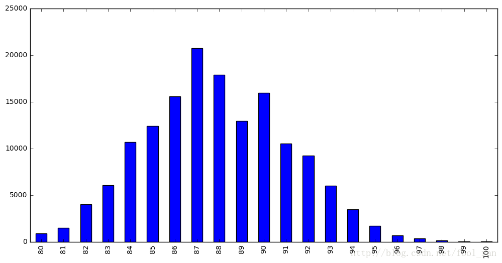
figsize控制图片的大小,它的单位是英寸。使用的参数对应的是(宽,高).接下来,我们将改变颜色,color参数。
df_reviews['points'].value_counts().sort_index().plot.bar(
    figsize=(12,6),
    color='red'
)
<matplotlib.axes._subplots.AxesSubplot at 0x7f156d6e7550>
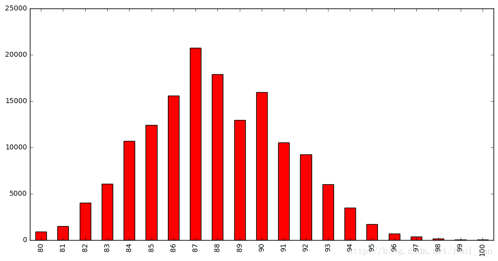
当图片非常小的时候,坐标轴上的文本,我们很难看清楚,这里的图像很大,并不会有什么影响。其实,可以通过fontsize参数来修改文本的大小。
df_reviews['points'].value_counts().sort_index().plot.bar(
    figsize=(12,6),
    color='red',
    fontsize=16
)
<matplotlib.axes._subplots.AxesSubplot at 0x7f156d516048>
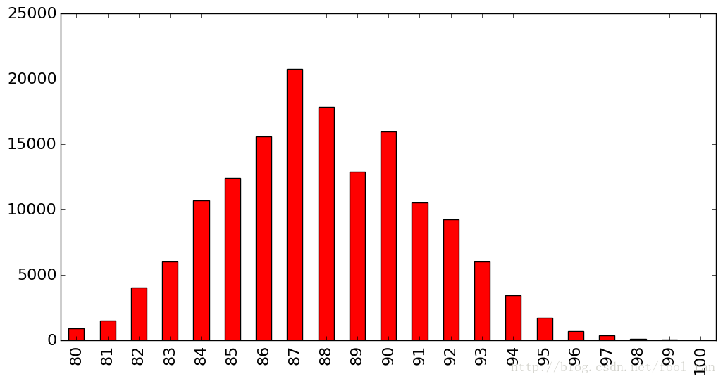
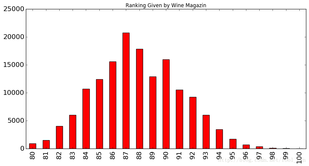
我们还需要一个标题。需要提醒大家的是:matplotlib并不是很好的支持 中文 的显示。
df_reviews['points'].value_counts().sort_index().plot.bar(
    figsize=(12,6),
    color='red',
    fontsize=16,
    title='Ranking Given by Wine Magazin',
)
<matplotlib.axes._subplots.AxesSubplot at 0x7f156c9f4080>
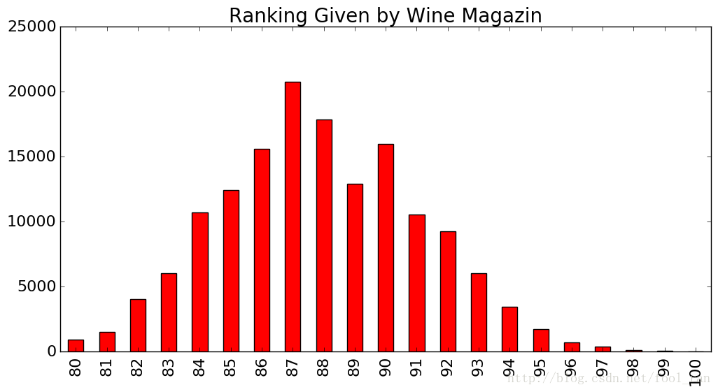
很不幸,我们的标题有点小,然而pandas的数据可视化,并没有给我们提过修改标题大小的参数。但是我们知道pandas的数据可视化接口都来自matlotlib库,而且matplotlib提供的修改title的大小的方法。因此我们可以先得到matpoltlib对象,再进行添加其他的参数。
ax = df_reviews['points'].value_counts().sort_index().plot.bar(
    figsize=(12,6),
    color='red',
    fontsize=16
)

ax.set_title('Ranking Given by Wine Magazin',fontsize=20)
<matplotlib.text.Text at 0x7f156aa13f98>
在上个 cell 中,我们首先得到matplotlib的对应,在进行设置其他的参数。下面要介绍另一个包seaborn,它比matplotlib更简单。
它也是基于matplotlib进行封装的。我们可以使用seaborn.despine方法,去掉坐标轴的线。
import seaborn as sns

ax = df_reviews['points'].value_counts().sort_index().plot.bar(
    figsize=(12,6),
    color='red',
    fontsize=16,
)
ax.set_title('Ranking Given by Wine Magazin', fontsize=20)

sns.despine(bottom=True, left=True)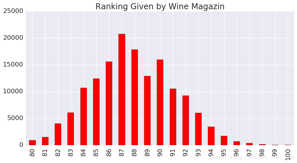
Prefect,上面这个图已经很清晰的解释了图表的意义。对图片的style,我们能够做的事情有很多,不仅仅是上面介绍的一些。不同的plot有不同style格式,color是最普遍的,在scatter中s对应的是size。
提高设计的技巧。
df_pokemon = pd.read_csv('../dataSet/pokemon_simple.csv')
df_pokemon.head()
| # | Name | Type 1 | Type 2 | Total | HP | Attack | Defense | Sp. Atk | Sp. Def | Speed | Generation | Legendary | |
|---|---|---|---|---|---|---|---|---|---|---|---|---|---|
| 0 | 1 | Bulbasaur | Grass | Poison | 318 | 45 | 49 | 49 | 65 | 65 | 45 | 1 | False |
| 1 | 2 | Ivysaur | Grass | Poison | 405 | 60 | 62 | 63 | 80 | 80 | 60 | 1 | False |
| 2 | 3 | Venusaur | Grass | Poison | 525 | 80 | 82 | 83 | 100 | 100 | 80 | 1 | False |
| 3 | 3 | VenusaurMega Venusaur | Grass | Poison | 625 | 80 | 100 | 123 | 122 | 120 | 80 | 1 | False |
| 4 | 4 | Charmander | Fire | NaN | 309 | 39 | 52 | 43 | 60 | 50 | 65 | 1 | False |
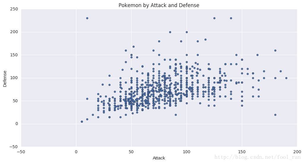
# 画出 Attacl 和 Defense对应的散点图,并修改大小,添加title
df_pokemon.plot.scatter(x='Attack', y='Defense', figsize=(12,6), title='Pokemon by Attack and Defense')
<matplotlib.axes._subplots.AxesSubplot at 0x7f156a93b6a0>
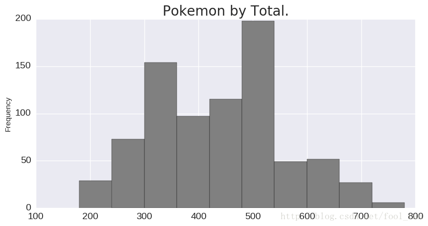
# 显示Total变量对应的直方图分布
ax = df_pokemon['Total'].plot.hist(
    figsize=(10,5),
    fontsize=14,
    color='gray',
)
ax.set_title('Pokemon by Total.', fontsize=20)
<matplotlib.text.Text at 0x7f155d3c2e80>
# pokemon Type对应的主要类型
ax = df_pokemon['Type 1'].value_counts().plot.bar(
    figsize=(12,6),
    color='green',
    fontsize=14,
)
ax.set_title('Pokemon by Primary Type', fontsize=20)
sns.despine(bottom=True,left=True)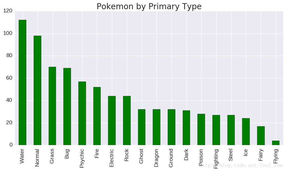
在这个section中,我们学习了一些小的作图的技巧,使我们的图形更加的吸引人,高效,便于交互。这里主要学习了matplotlib库函数。下一节我们要学习的Subplots。
原文地址: https://www.kaggle.com/residentmario/bivariate-plotting-with-pandas
免责声明:本文系网络转载或改编,未找到原创作者,版权归原作者所有。如涉及版权,请联系删
 技术文档
技术文档
 推荐好文
推荐好文


 155-2731-8020


