


简介
scCustomize是一个单细胞转录组数据可视化的R包,里面集合了一些常用的数据可视化方法,可以与Seurat包进行很好的联用,支持Seurat,LIGER和SCE等常用对象的数据。
image.png
R包安装
直接使用devtools包进行安装
devtools::install_github(repo = "samuel-marsh/scCustomize")
remotes::install_github(repo = "samuel-marsh/scCustomize")
实例演示
在本教程中,我将使用来自 Marsh 等人 2020 ( bioRxiv ) 的小鼠小胶质细胞(图 1)marsh_mouse_micro和人类死后的 snRNA-seq(图 3)marsh_human_pm,以及SeuratData 包中的 pbmc3k 数据集进行实例演示。
加载示例数据
library(tidyverse)
library(patchwork)
library(viridis)
library(Seurat)
library(scCustomize)
library(qs)

# Load bioRxiv datasets
marsh_mouse_micro <- qread(file = "assets/marsh_2020_micro.qs")
marsh_human_pm <- qread(file = "assets/marsh_human_pm.qs")

# Load pbmc dataset
pbmc <- pbmc3k.SeuratData::pbmc3k.final

# add metadata
pbmc$sample_id <- sample(c("sample1", "sample2", "sample3", "sample4", "sample5", "sample6"), size = ncol(pbmc),
    replace = TRUE)
pbmc$treatment <- sample(c("Treatment1", "Treatment", "Treatment3", "Treatment4"), size = ncol(pbmc),
    replace = TRUE)
数据可视化
- 绘制高变异基因
scCustomize 包可以使用VariableFeaturePlot_scCustom()函数绘制高度可变基因,同时提供了多个可用于自定义可视化的附加参数。
# Default scCustomize plot
VariableFeaturePlot_scCustom(seurat_object = marsh_mouse_micro, num_features = 20)

# Can remove labels if not desired
VariableFeaturePlot_scCustom(seurat_object = marsh_mouse_micro, num_features = 20, label = FALSE)

# Repel labels
VariableFeaturePlot_scCustom(seurat_object = marsh_mouse_micro, num_features = 20, repel = TRUE)

# Change the scale of y-axis from linear to log10
VariableFeaturePlot_scCustom(seurat_object = marsh_mouse_micro, num_features = 20, repel = TRUE,
    y_axis_log = TRUE)
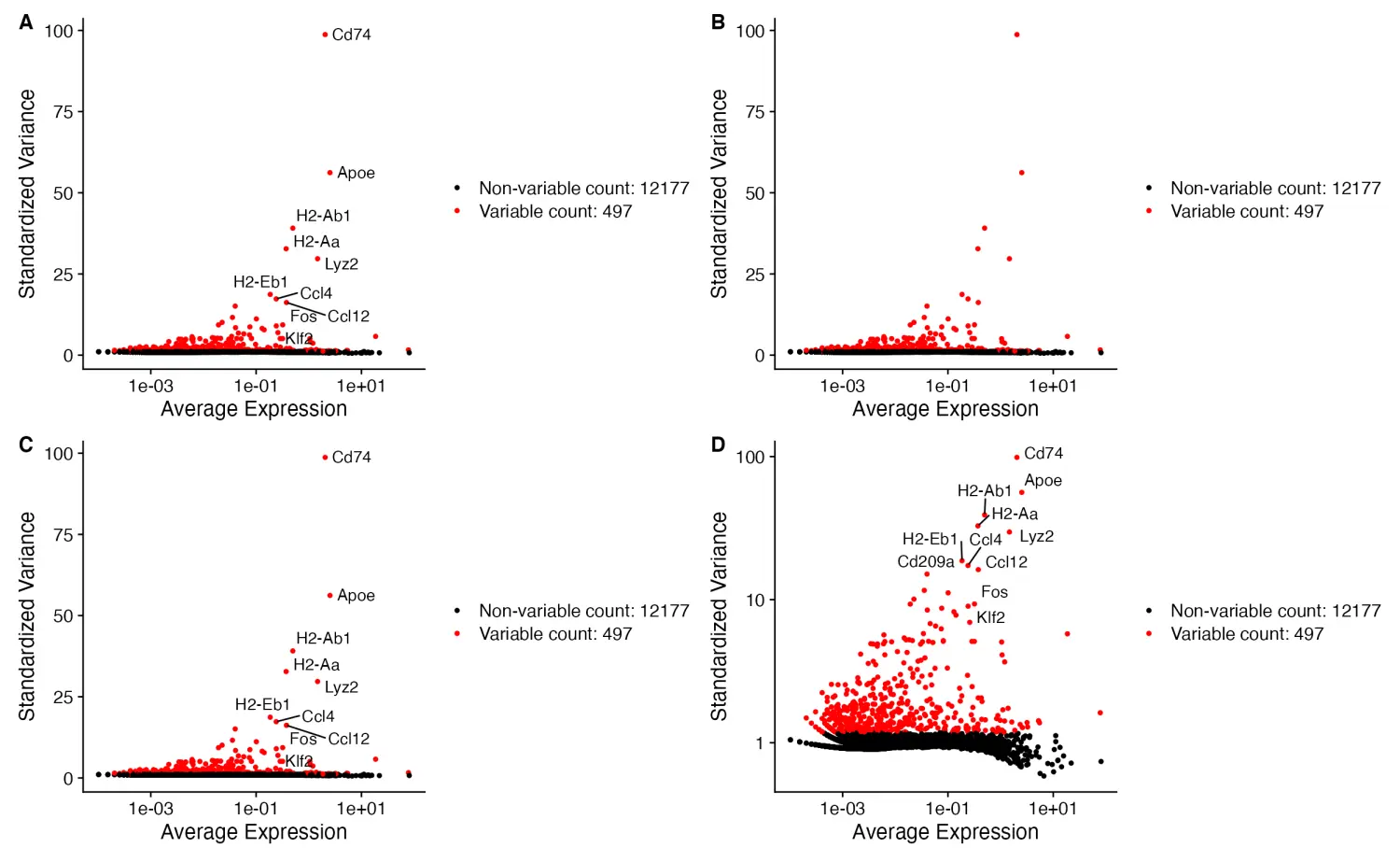
image.png
- 绘制PC主成分热图
为了便于评估 PCA 降维结果,scCustomize 包提供了PC_Plotting()函数绘制 PC主成分热图和特征基因加载图。
PC_Plotting(seurat_object = marsh_mouse_micro, dim_number = 2)
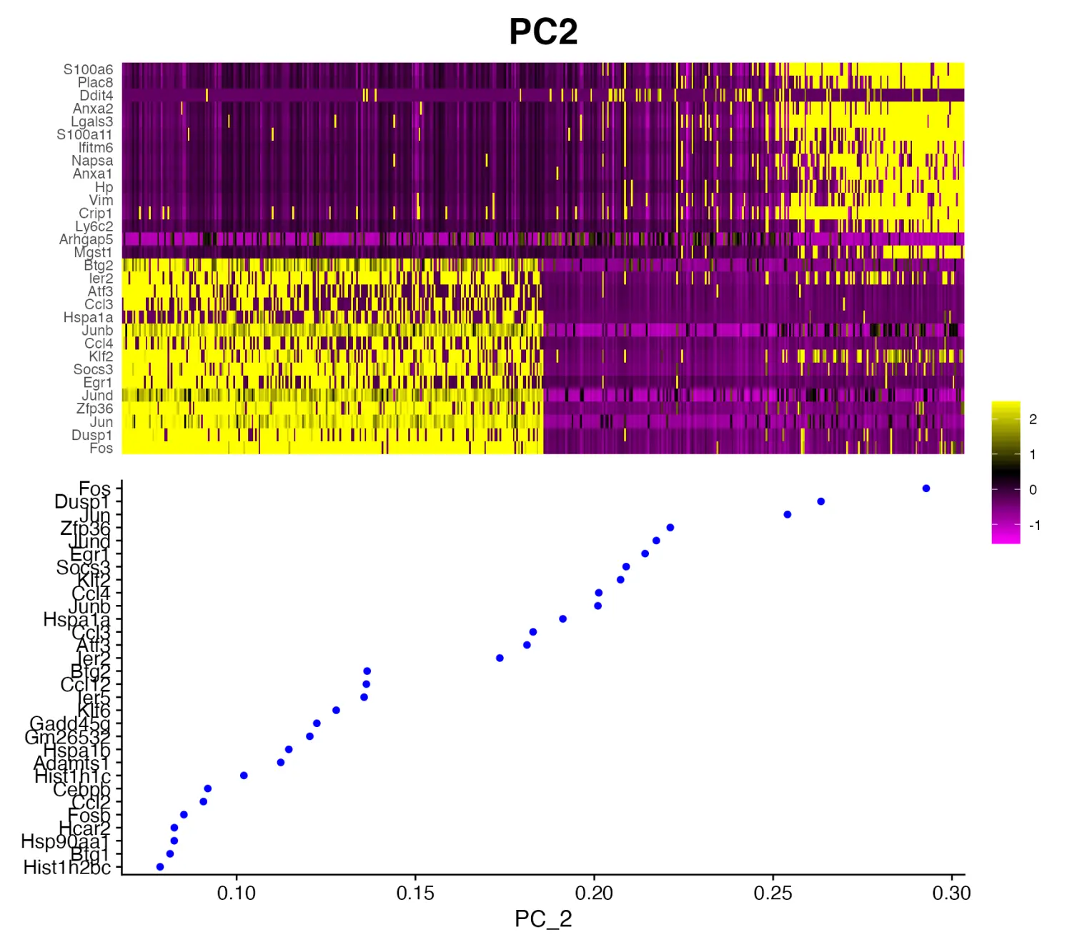
image.png
- FeaturePlot
默认Seurat包的Seurat::FeaturePlot()函数的绘图效果也很不错,在这里我们可以通过scCustomize包的FeaturePlot_scCustom()函数默认设置的几种方式进行功能的增强。默认情况下,FeaturePlot_scCustom函数的参数order = TRUE是默认值,可以将高表达的细胞绘制在顶部。
# Set color palette
pal <- viridis(n = 10, option = "C", direction = -1)

# Create Plots
FeaturePlot(object = marsh_mouse_micro, features = "Jun")
FeaturePlot(object = marsh_mouse_micro, features = "Jun", order = T)
FeaturePlot(object = marsh_mouse_micro, features = "Jun", cols = pal, order = T)
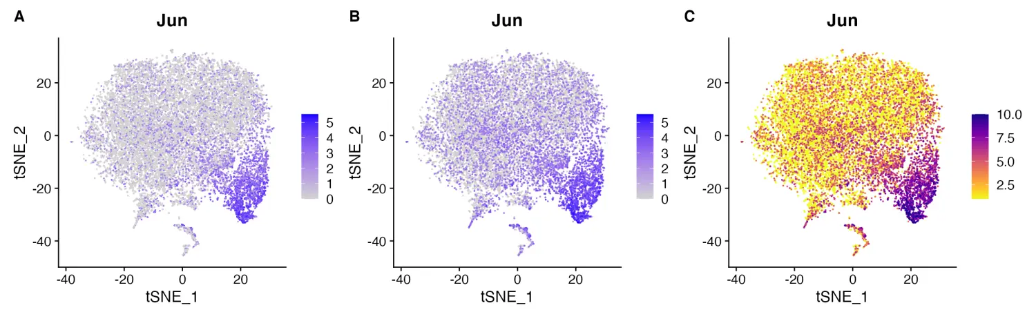
image.png
# Set color palette
pal <- viridis(n = 10, option = "D")

# Create Plots
FeaturePlot_scCustom(seurat_object = marsh_mouse_micro, features = "Jun", order = F)
FeaturePlot_scCustom(seurat_object = marsh_mouse_micro, features = "Jun")
FeaturePlot_scCustom(seurat_object = marsh_mouse_micro, features = "Jun", colors_use = pal)
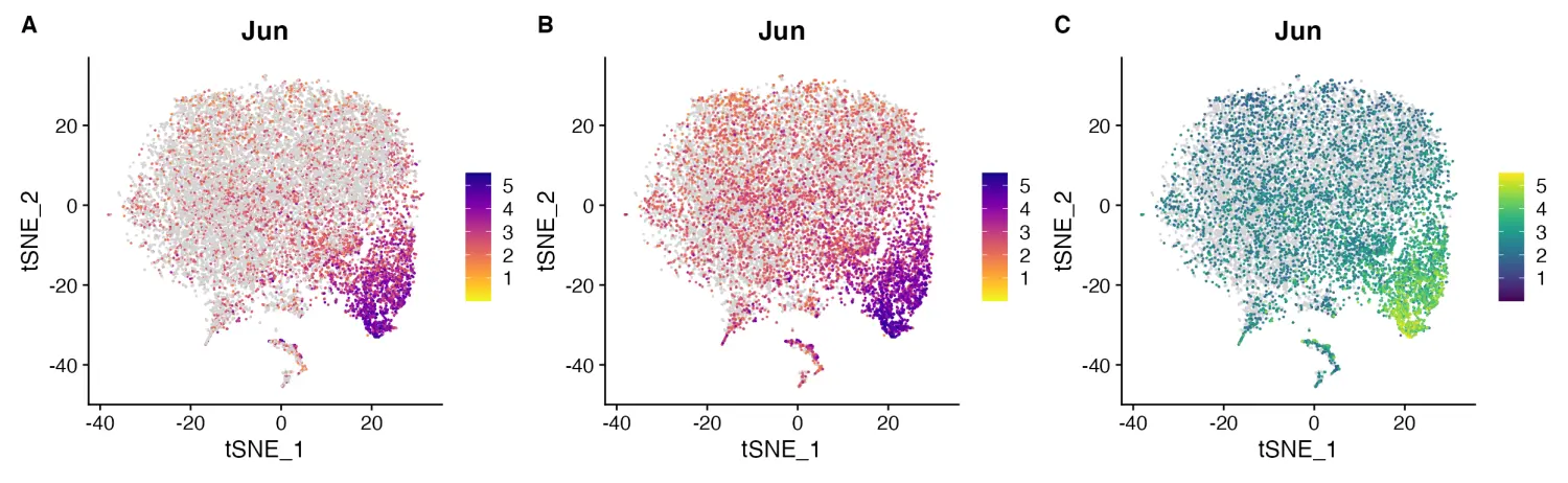
image.png
- Split Feature Plots
Seurat::FeaturePlot()函数在按object@meta.data 中的变量进行拆分绘图时不再可以指定输出的列数,这使得可视化具有很多变量的对象变得困难,图形经常挤到一起。
FeaturePlot(object = marsh_mouse_micro, features = "P2ry12", split.by = "orig.ident")
image.png
FeaturePlot_scCustom 解决了这个问题,并允许设置 FeaturePlots 中的列数
FeaturePlot_scCustom(seurat_object = marsh_mouse_micro, features = "P2ry12", split.by = "sample_id",
    num_columns = 4)
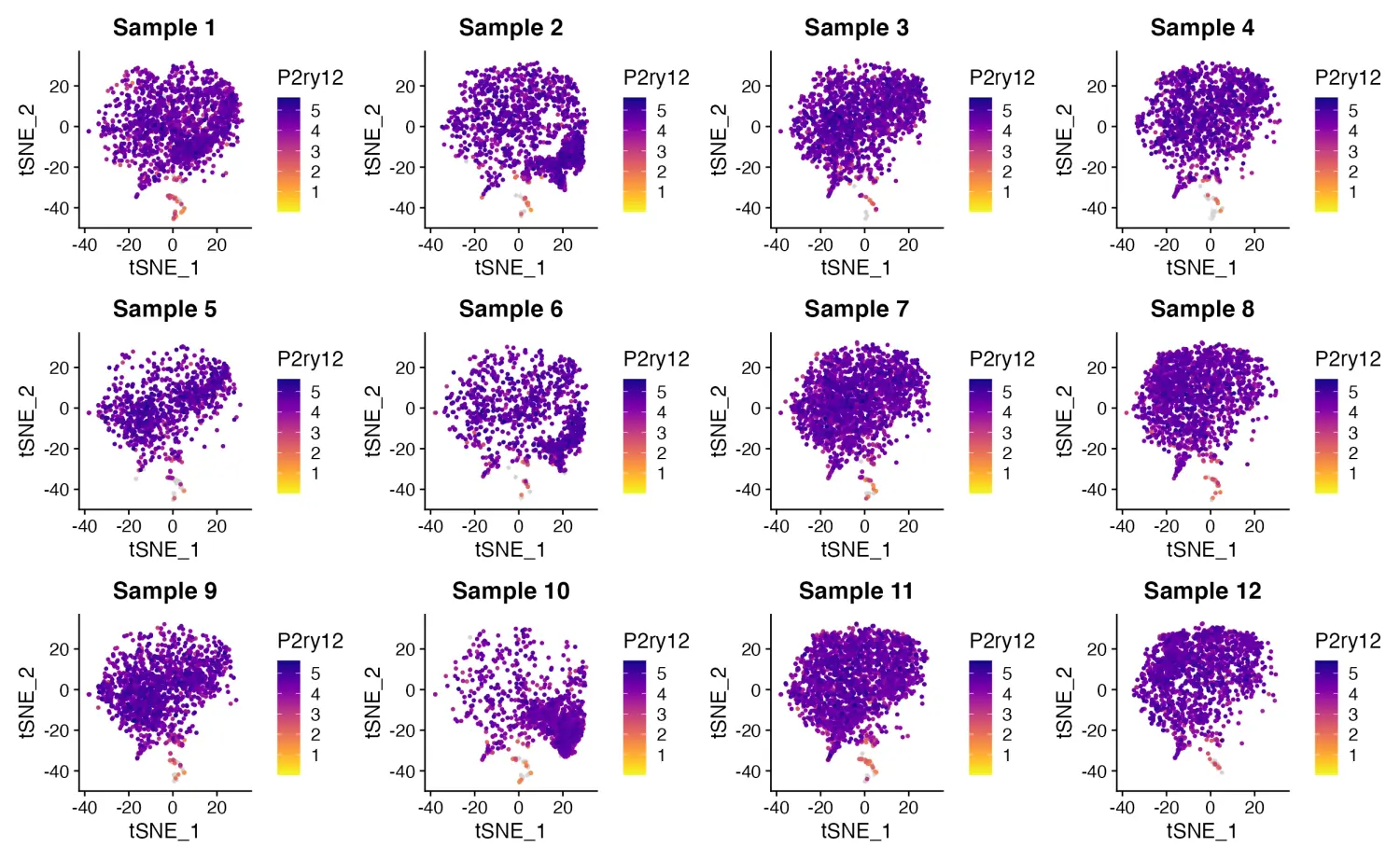
image.png
- Density Plots
Nebulosa包为通过密度图绘制基因表达提供了非常棒的功能。scCustomize 包提供了两个函数来扩展这些图的功能并便于绘制“联合”密度图。
自定义调色板
目前,Nebulosa 包仅支持使用 viridis 调色板中的5个画板:“viridis”、“magma”、“cividis”、“inferno”和“plasma”。Plot_Density_Custom()函数将默认调色板更改为“magma”,还允许使用任何自定义渐变画板。
Plot_Density_Custom(seurat_object = marsh_mouse_micro, features = "Fos")
Plot_Density_Custom(seurat_object = marsh_mouse_micro, features = "Fos", custom_palette = PurpleAndYellow())
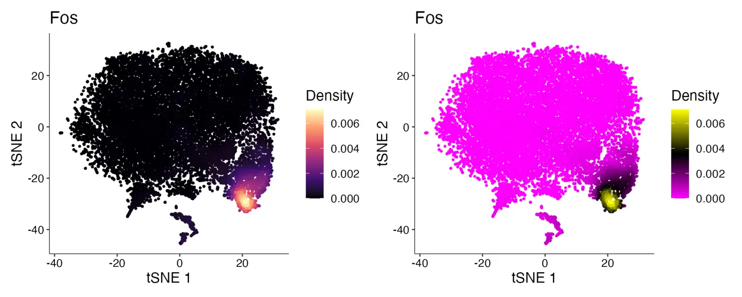
image.png
绘制联合密度图
使用Plot_Density_Joint_Only()函数同时绘制多个基因的联合密度图。
Plot_Density_Joint_Only(seurat_object = marsh_mouse_micro, features = c("Fos", "Jun"))
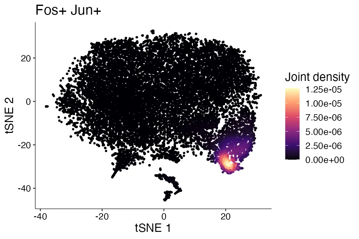
image.png
- Dual Assay Plotting
当对象中同时含有多个assay的数据,我们可以使用FeaturePlot_DualAssay()函数同时绘制不同assay中的数据。
cell_bender_example <- qread("assets/astro_nuc_seq.qs")
FeaturePlot_DualAssay(seurat_object = cell_bender_example, features = "Syt1", assay1 = "RAW", assay2 = "RNA")
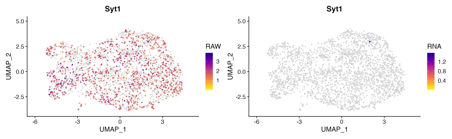
image.png
- Stacked Violin Plots
与Seurat包的Seurat::VlnPlot()函数相比,scCustomize 包提供了更美观的堆叠小提琴图绘制函数Stacked_VlnPlot()。
gene_list_plot <- c("SLC17A7", "GAD2", "AQP4", "MYT1", "COL1A2", "CLDN5", "OPALIN", "CX3CR1", "CD3E")
human_colors_list <- c("dodgerblue", "navy", "forestgreen", "darkorange2", "darkorchid3", "orchid",
    "orange", "gold", "gray")

# Create Plots
Stacked_VlnPlot(seurat_object = marsh_human_pm, features = gene_list_plot, x_lab_rotate = TRUE,
    colors_use = human_colors_list)
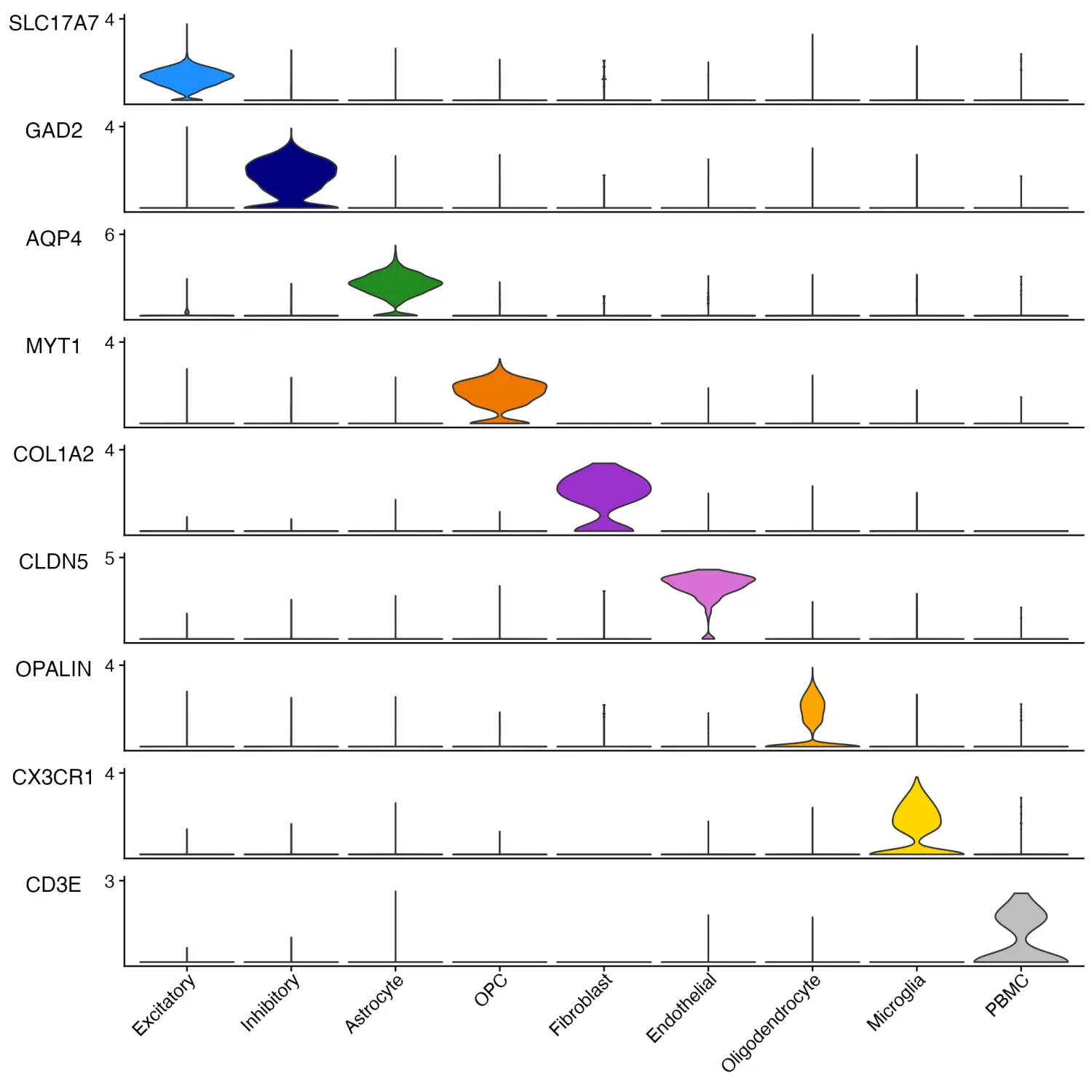
image.png
绘制分割堆叠小提琴图
sample_colors <- c("dodgerblue", "forestgreen", "firebrick1")

# Create Plots
Stacked_VlnPlot(seurat_object = marsh_human_pm武汉格发信息技术有限公司,格发许可优化管理系统可以帮你评估贵公司软件许可的真实需求,再低成本合规性管理软件许可,帮助贵司提高软件投资回报率,为软件采购、使用提供科学决策依据。支持的软件有: CAD,CAE,PDM,PLM,Catia,Ugnx, AutoCAD, Pro/E, Solidworks 等。

 技术文档
技术文档
 推荐好文
推荐好文


 155-2731-8020